If you’ve been thinking about building your own personal blog, the tooling choices can feel endless. There are so many frameworks, static site generators, and CMSes available today. There’s nothing wrong with any of these, but they can be limiting when it comes to design and functionality.
I wanted something different: a blog that felt entirely mine, with full control over the style and every piece of the writing and publishing experience.
This post breaks down how the site works: the stack, the content system, my custom components and styles, and some of the little helpers that make it all feel polished. My site is also entirely open source on GitHub. Feel free to explore the codebase and copy whatever you find useful.
Thanks to Josh W. Comeau for his own post How I Built My Blog, which inspired me to write this one.
The Stack
The stack is intentionally small:
- Webpack for the build and asset pipeline—I created this site several years ago, and it already used Webpack, so it made sense to extend it.
- Markdoc for Markdown & custom tags.
- gray-matter for frontmatter parsing.
- JSDOM for manipulating HTML at build time.
- highlight.js for syntax highlighting code blocks at build time.
This blog is entirely static. No database, no API routes, no persistent backend. I prefer the simplicity: if something can be precomputed at build time, it is.
Webpack does the static generation by creating an HtmlWebpackPlugin instance for every post:
/* webpack.config.js */

const blogPosts = collectBlogPostsMeta(BLOG_DIR);

const blogHtmlPlugins = blogPosts.map((post) => {
  return new HtmlWebpackPlugin({
    filename: `blog/${post.slug}.html`,
    favicon: FAVICON_PATH,
    templateContent: () => {
      let content = fs.readFileSync(post.filePath, 'utf8');

      const processed = processMarkdown(content, post.filePath);
      content = processed.html;
      const metadata = processed.metadata;

      // ... inject content into template

      return applyBaseLayout(pageHtml);
    },
  });
});
It’s nothing fancy; just a few moving parts that work well together. Let’s dive into the details of how it all works.
The Secret Ingredient
Markdoc is what makes the blog feel like a custom product. It parses Markdown into an Abstract Syntax Tree (AST), then renders that AST into HTML. This allows me to intercept the parsing process and inject my own logic at various stages.
On top of that, writing in Markdown is simply a much better experience than writing in raw HTML: it’s easier to read and write, it keeps my focus on the content rather than the markup, and I don’t have to worry about wrapping every single paragraph in <p> tags.
Markdoc also has support for custom tags and node transforms, enabling me to build custom components and apply transformations to nodes as they’re being processed. Keep reading to see some examples of how I take advantage of this.
Custom Components
Blog Card
I knew early on that I would want a nice way to reference other posts I’ve written. A plain link works, but can be a bit underwhelming—I wanted to reference other posts in a way that felt alive! So I defined a custom {% blog-card %} tag which takes a src attribute targeting another post:
{% blog-card src="2026/01/26/hello-world" /%}
The custom component in markdoc-config.js reads the target post’s metadata and injects it into a template. The result is a fully styled card with the post’s title, date, estimated reading time, header image preview, and tags, generated at build time. Here’s how it looks:
Node Transforms
Links
I usually want external links to open in a new tab via target="_blank", but sometimes I want to override this. Unfortunately, Markdown doesn’t support this natively, so I wrote a custom Markdoc transform that processes every link node:
// src/helpers/markdoc-config.js

export default {
  nodes: {
    // Custom link node to automatically open external links in a new tab
    link: {
      render: 'a',
      attributes: {
        href: { type: String },
        title: { type: String },
      },
      transform(node, config) {
        const attributes = node.transformAttributes(config);
        const children = node.transformChildren(config);

        const href = attributes.href || '';

        const isNewTab = href.startsWith('newtab:');
        const isSameTab = href.startsWith('sametab:');
        const isExternal = href.startsWith('http');

        if (isNewTab || (!isSameTab && isExternal)) {
          attributes.target = '_blank';
          attributes.rel = 'noopener noreferrer';
        }

        attributes.href = href.replace(/^(new|same)tab:/, '');

        return new Tag('a', attributes, children);
      },
    },
    // other node transforms...
  },
};
Here’s how it works:
- Default behavior:
- External links (starting with
http) open in a new tab:[Google](https://www.google.com)<a href="https://www.google.com" target="_blank">Google</a> - Internal links open in the same tab:
[Home](/)<a href="/">Home</a>
- Overrides:
- Prepending
newtab:to the URL forces an internal link to open in a new tab:[Home](newtab:/)<a href="/" target="_blank">Home</a> - Prepending
sametab:to the URL forces an external link to open in the same tab:[Google](sametab:https://google.com)<a href="https://google.com">Google</a>
Lists
I built a custom Markdoc transform that processes every list item node, wrapping the contents of all <li> elements in a <div>:
// src/helpers/markdoc-config.js

export default {
  nodes: {
    // Custom list item node to wrap content in a div for better styling
    item: {
      render: 'li',
      transform(node, config) {
        const attributes = node.transformAttributes(config);
        const children = node.transformChildren(config);
        return new Tag('li', attributes, [new Tag('div', {}, children)]);
      },
    },
    // other node transforms...
  },
};
This wrapper <div> ensures text is aligned properly for multi-line items—since I’m using custom markers with CSS counters (more on that later) and applying ol, ul { display: flex; } to align the markers vertically, things can get a little messy without that <div> wrapper around the text content.
Here’s an example of the markdown for a nested list:
1. First item
2. Second item
   - Nested item
Which is converted to the following markup:
<ol>
  <li><div>First item</div></li>
  <li>
    <div>
      Second item
      <ul>
        <li>
          <div>Nested item</div>
        </li>
      </ul>
    </div>
  </li>
</ol>
And here’s how it looks:
- First item
- Second item
- Nested item
Without wrapping the content in a <div>, the nested list item would appear beside the “Second item” text, which is not what I want:
- First item
- Second item
- Nested item
The extra <div> wrapper ensures proper block layout within the flex container.
Tables
To prevent tables from breaking mobile layouts, I have a transform that wraps every <table> in a container div (.table-wrapper). This lets the table scroll horizontally on small screens without breaking the layout of the page itself.
// src/helpers/markdoc-config.js

export default {
  nodes: {
    // Custom table node to wrap tables in a div container for responsive styling
    table: {
      render: 'table',
      transform(node, config) {
        const attributes = node.transformAttributes(config);
        const children = node.transformChildren(config);
        return new Tag('div', { class: 'table-wrapper' }, [new Tag('table', attributes, children)]);
      },
    },
    // other node transforms...
  },
};
Markdoc supports a nice list-based syntax for defining tables, which is simpler, more flexible, and more powerful than the standard Markdown pipe-and-dash syntax. Markdoc tables support rich text, including code samples and lists, and even allow for custom attributes on cells if needed. I can just write the table as a list of rows and columns, and Markdoc takes care of the rest.
Here’s an example of the markdown for a table:
{% table %}

- Header A {% .sticky %}
- Header B
- Header C

---

- Row 1, Col 1
- Row 1, Col 2
- Row 1, Col 3

---

- Row 2, Col 1
- Row 2, Col 2
- Row 2, Col 3

{% /table %}
Which is converted to the following markup:
<div class="table-wrapper">
  <table>
    <thead>
      <tr>
        <th class="sticky">Header A</th>
        <th>Header B</th>
        <th>Header C</th>
      </tr>
    </thead>
    <tbody>
      <tr>
        <td>Row 1, Col 1</td>
        <td>Row 1, Col 2</td>
        <td>Row 1, Col 3</td>
      </tr>
      <tr>
        <td>Row 2, Col 1</td>
        <td>Row 2, Col 2</td>
        <td>Row 2, Col 3</td>
      </tr>
    </tbody>
  </table>
</div>
Skipping Headings in Table of Contents
Sometimes I have headings that I don’t want to appear in the table of contents (TOC). To handle this, I set up a transform so I can add a data-toc-skip="true" attribute to any heading I want to exclude:
// src/helpers/markdoc-config.js

export default {
  nodes: {
    // Custom heading node to support data-toc-skip attribute
    heading: {
      children: ['inline'],
      attributes: {
        'data-toc-skip': { type: Boolean },
      },
      transform(node, config) {
        const attributes = node.transformAttributes(config);
        const children = node.transformChildren(config);
        return new Tag(`h${node.attributes.level}`, attributes, children);
      },
    },
    // other node transforms...
  },
};
Then I filter out those headings when building the TOC. Here’s an example:
### Heading to Include

### Heading to Exclude {% data-toc-skip=true %}
Which is converted to the following markup:
<h3>Heading to Include</h3>

<h3 data-toc-skip="true">Heading to Exclude</h3>
Metadata
Dates from File Path
I knew from the start that I did NOT want to manually manage dates in frontmatter. It’s tedious, easy to forget, and I knew eventually it would come back to bite me. Instead, the file path is the source of truth. A file at src/blog/2026/01/26/my-post.md is dated as “January 26, 2026” automatically, via this small but nifty helper:
/* src/helpers/blog-build.js */

function extractDateFromPath(pathStr) {
  const match = pathStr.match(/(?<year>\d{4})\/(?<month>\d{2})\/(?<day>\d{2})\//);
  if (match) {
    const { year, month, day } = match.groups;
    return [year, month, day].join('-');
  }
}
Frontmatter stays minimal, and the date always matches with where the file lives.
Skipping Action Buttons
If you scroll to the bottom of this post, you’ll see a couple buttons to copy the URL or scroll back to the top. However, I don’t want these on every post—only some of them. To solve this, I added a skip_actions frontmatter flag. If it’s set to true, those buttons are omitted. Take a look at my “Hello, World” post, and you’ll notice that the action buttons at the bottom are omitted:
Blog Index
On the /blog page, I have a chronological list of posts, which is generated at build time. The build process scans src/blog/, extracts metadata, and generates the list.
The underlying idea is simple:
- Read all
.mdfiles undersrc/blog/. - Parse frontmatter and infer the date from the file path.
- Sort posts by date from newest to oldest.
- Inject into the index template.
No need for anything more complicated than that.
Styling & Polish
I wanted the blog to feel polished and intentional, so I added a lot of custom styles and little details to make the reading experience enjoyable. Continue reading to see some examples and the CSS techniques I used to achieve them.
Scoped Styles
I use CSS @scope to isolate the blog’s design. This ensures that typography and layout rules apply only to the blog content (.blog) and explicitly stop at any element with the class .blog-reset.
/* src/blog.css */

@scope (.blog) to (.blog-reset) {
  /* Blog styles here... */
}
This Donut Scope is perfect for embedding custom components or interactive demos within a post. By wrapping them in .blog-reset, I ensure they aren’t affected by the blog’s global styles, giving me a blank canvas for those specific elements.
For example, I can easily embed this custom HTML styled with Tailwind from the homepage of my site without any style conflicts:
Example of a section wrapped in .blog-reset:


Without @scope, the styles from the blog would bleed into this section, causing visual inconsistencies. The difference is quite obvious if I remove the blog-reset wrapper.
Example of a section without .blog-reset:
The blog styles are leaking into the images in the component, messing up the layout, the image styles, and even the color of the captions. The first example (with .blog-reset) retains the intended design of that section, while the second example (without .blog-reset) is affected by the blog’s styles bleeding into it, disrupting the intended design.
Heading Links & Table of Contents
Every h2-h6 gets an auto-generated ID and a small anchor icon on hover. Try hovering over any heading in this post to see it. Those headings also power the sidebar table of contents, which you can see to the right (if you’re on desktop).
During the Markdoc parsing phase, a function traverses the AST and builds a tree of all the headings found in the document. This tree is then rendered as a nested list in the sidebar. If a post has fewer than three headings, the Table of Contents is omitted to keep the layout clean.
Clear & Intuitive Links
Links have different styles depending on their destination.
- Internal links have a dotted underline and change color on hover: Home
- External links have an arrow appended, which animates on hover: Google
- Email links have a mail icon prepended, which opens on hover: Email
Custom Highlights
The default browser yellow highlight for <mark> elements is… a bit harsh. So I added a custom style for them that fits better with the overall design, along with some additional fun color options, which I can easily apply with classes like .green, .red or .purple.
Text highlights are a great way to draw attention to important points or key takeaways. You can also use them for a little bit of stylistic flair, or for warnings. For example: don’t include six highlights in a single paragraph!
Highlights use box-decoration-break: clone to ensure highlights that span multiple lines look continuous across line breaks, without any awkward gaps. Here’s a really long one to demonstrate that effect. Notice how the highlight wraps around the text smoothly, even as it breaks across lines. These are the kinds of details that I obsess over. Without box-decoration-break: clone, the highlight would have flat edges at each line break, which can look a bit disjointed.
I can imagine using highlights inside blockquotes to give the reader the feeling of a highlighter pen annotating a physical book. This adds a tactile, personal touch to the content, making it feel more engaging and less like a standard web page. The web should be a place of beauty and personality, not just a sea of black text on a white background!
Text Selection
In the same vein as custom highlights, I also wanted to make the text selection experience a little nicer. By chance, I recently came across History of Software Design, which has a really nice text selection style that changes the color of the text and adds a dashed underline:
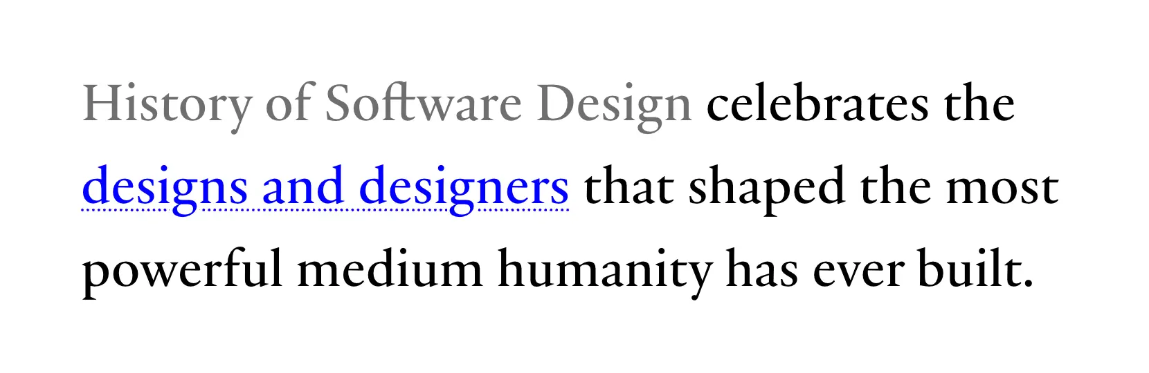
I loved the effect and decided to implement something similar on my site.
Since I wanted this to apply across my entire site (not just the blog), I defined a custom selection style in my global stylesheet using the ::selection pseudo-element:
/* src/theme.css */
@theme {
  --selection-color: oklch(from var(--color-primary-500) l c h / 5%);
}

/* src/style.css */
::selection {
  background: var(--selection-color);
  color: var(--color-accent);
  text-decoration: dotted underline var(--color-accent);
  text-decoration-thickness: 1px;
  text-underline-offset: 2px;
}
I opted for a dotted underline instead of dashed to prevent the underline from shifting around too much as the selection changes. The color and underline alone still felt just a little too subtle, so I added a mostly-transparent background color to make it a bit more obvious when text is selected.
Images & Figures
Images are centered and have a nice frame with a subtle border and shadow to make them pop off the page. The corners are ever-so-slightly rounded to give them a softer, more polished look. Here’s an example from placehold.co:
Figures can include captions:
Prettier Lists
List markers are quite limited in how they can be styled with CSS. I wanted more control, so I disabled the default markers and instead used CSS counters to create custom markers. This allows for more flexible styling, including custom fonts, colors, and sizes. Here are some examples:
Unordered List:
- Item 1
- Item 2
- Nested Item 1
- Nested Item 2
Ordered List:
- First item
- Second item
- Nested item A
- Nested item B
Mixed List:
- First item
- Nested item A
- Nested item B
- Second item
- Nested item C
- Nested item D
- Deeply nested item i
- Deeply nested item ii
- Even deeper item α
- Even deeper item β
Blockquotes That Actually Look Like Quotes
Blockquotes get a distinct background and a decorative “ so they feel like a different “voice,” not just italic text:
Here’s to the crazy ones. The misfits. The rebels. The troublemakers. The round pegs in the square holes. The ones who see things differently. They’re not fond of rules. And they have no respect for the status quo. You can quote them, disagree with them, glorify or vilify them. About the only thing you can’t do is ignore them. Because they change things. They push the human race forward. And while some may see them as the crazy ones, we see genius. Because the people who are crazy enough to think they can change the world, are the ones who do.
Steve Jobs
Beautiful Code
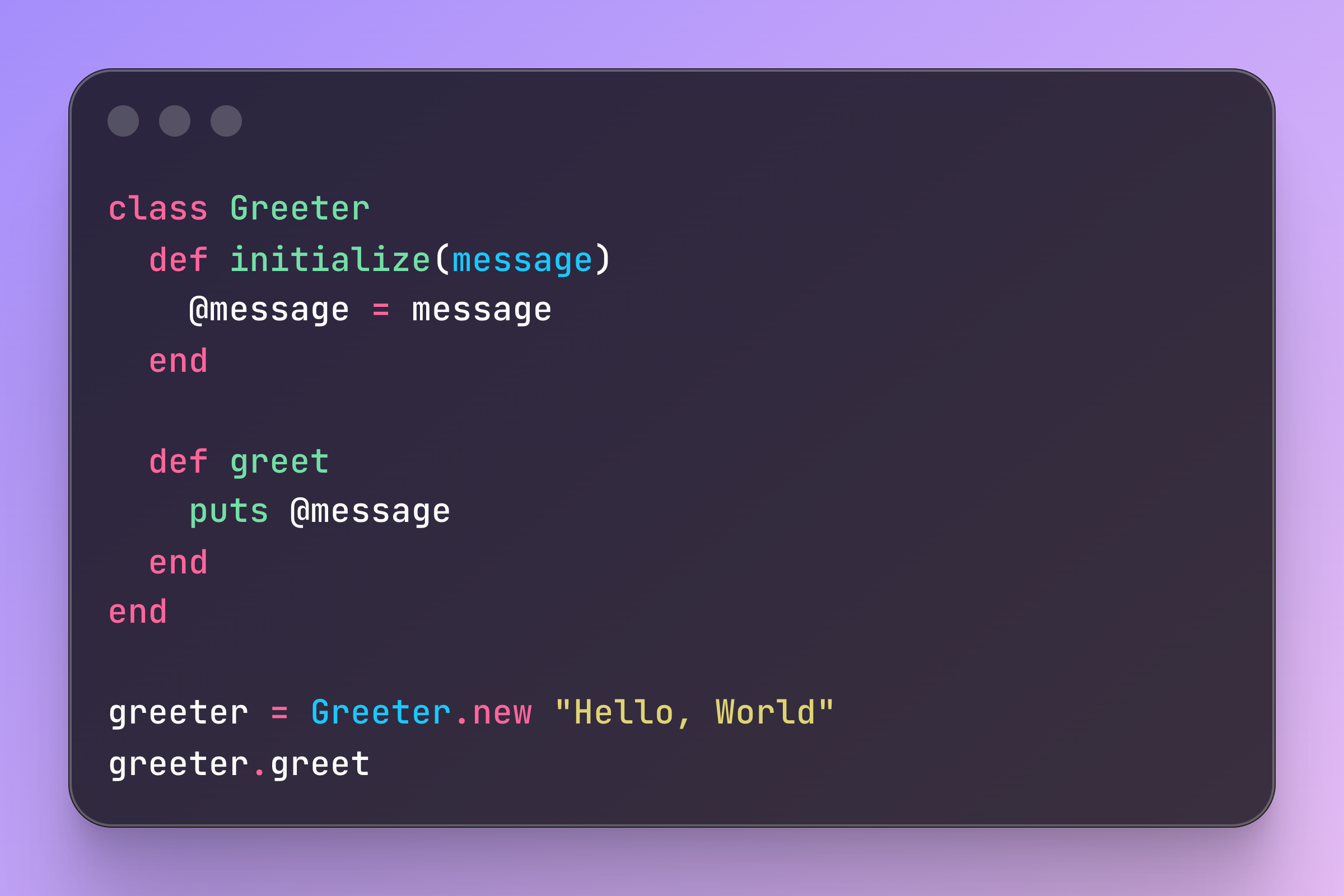
You’ve already seen multiple examples of inline code and code blocks in this post. I wanted to make those feel special, so I added a few enhancements: syntax highlighting & copy buttons.
Syntax Highlighting
I highlight code blocks at build time using highlight.js. The browser never sees the raw code—just the already-colored HTML:
/* src/helpers/apply-base-layout.js */

function highlightCodeBlocks(html) {
  const dom = new JSDOM(html);
  const codeBlocks = dom.window.document.querySelectorAll('pre > code');

  for (const codeEl of codeBlocks) {
    const classList = Array.from(codeEl.classList);
    const langClass = classList.find((c) => c.startsWith('language-'));
    const explicitLang = langClass?.replace(/^language-/, '');

    const codeText = codeEl.textContent || '';
    if (!codeText.trim()) continue;

    let result;
    if (explicitLang && hljs.getLanguage(explicitLang)) {
      result = hljs.highlight(codeText, { language: explicitLang });
    } else {
      result = hljs.highlightAuto(codeText);
    }

    codeEl.innerHTML = result.value;

    codeEl.classList.add('hljs');
    const finalLang = explicitLang || result.language;
    if (finalLang) codeEl.classList.add(`language-${finalLang}`);
  }

  return dom.serialize();
}
Code Copy Buttons
Have you ever been reading a blog post and had to manually select a code block with your mouse to copy it, only to accidentally select some extra text or miss a few characters? It’s frustrating! With these copy buttons, you can just click the button and the entire code block is copied to your clipboard. Try it out with the conveniently-placed code block below:
// src/helpers/init-code-copy-buttons.js

codeBlocks.forEach((codeBlock) => {
  const button = document.createElement('button');
  // assign button attributes and content

  button.addEventListener('click', async () => {
    await navigator.clipboard.writeText(codeBlock.textContent);
    // trigger animation
  });

  wrapper.appendChild(button);
});
Keyboard Tags
I like to use <kbd> tags to denote keyboard shortcuts. I designed custom styles for <kbd> elements adapted from this post by Dylan Smith to make them look more like physical keys, with subtle hover and click effects. <kbd> elements also react to keypresses. When you press a key that matches the content of a <kbd>, it animates as if it were being pressed.
For example, press ⌘ + ⇧ + R to force refresh the page. Or press ↑ ↑ ↓ ↓ ← → ← B A in sequence for a surprise...
Smart Tables
Tables scroll horizontally on small screens, and display scroll shadows as a visual cue when the table is scrollable (inspired by this article from CSS-Tricks). With some clever CSS, I can also make the first column sticky by adding a .sticky class to the first <th> element. Here’s an example of a table with a sticky first column and scroll shadows:
| Heading 1 | Heading 2 | Heading 3 | Heading 4 | Heading 5 | Heading 6 | Heading 7 | Heading 8 | Heading 9 | Heading 10 |
|---|---|---|---|---|---|---|---|---|---|
| Row 1 Cell 1 | Row 1 Cell 2 | Row 1 Cell 3 | Row 1 Cell 4 | Row 1 Cell 5 | Row 1 Cell 6 | Row 1 Cell 7 | Row 1 Cell 8 | Row 1 Cell 9 | Row 1 Cell 10 |
| Row 2 Cell 1 | Row 2 Cell 2 | Row 2 Cell 3 | Row 2 Cell 4 | Row 2 Cell 5 | Row 2 Cell 6 | Row 2 Cell 7 | Row 2 Cell 8 | Row 2 Cell 9 | Row 2 Cell 10 |
| Row 3 Cell 1 | Row 3 Cell 2 | Row 3 Cell 3 | Row 3 Cell 4 | Row 3 Cell 5 | Row 3 Cell 6 | Row 3 Cell 7 | Row 3 Cell 8 | Row 3 Cell 9 | Row 3 Cell 10 |
| Row 4 Cell 1 | Row 4 Cell 2 | Row 4 Cell 3 | Row 4 Cell 4 | Row 4 Cell 5 | Row 4 Cell 6 | Row 4 Cell 7 | Row 4 Cell 8 | Row 4 Cell 9 | Row 4 Cell 10 |
| Row 5 Cell 1 | Row 5 Cell 2 | Row 5 Cell 3 | Row 5 Cell 4 | Row 5 Cell 5 | Row 5 Cell 6 | Row 5 Cell 7 | Row 5 Cell 8 | Row 5 Cell 9 | Row 5 Cell 10 |
| Row 6 Cell 1 | Row 6 Cell 2 | Row 6 Cell 3 | Row 6 Cell 4 | Row 6 Cell 5 | Row 6 Cell 6 | Row 6 Cell 7 | Row 6 Cell 8 | Row 6 Cell 9 | Row 6 Cell 10 |
| Row 7 Cell 1 | Row 7 Cell 2 | Row 7 Cell 3 | Row 7 Cell 4 | Row 7 Cell 5 | Row 7 Cell 6 | Row 7 Cell 7 | Row 7 Cell 8 | Row 7 Cell 9 | Row 7 Cell 10 |
Horizontal Rules
Horizontal rules are used to separate sections. If you look closely, you’ll see that the left and right edges are rounded, giving them a softer, more polished look:
Icons Without an Icon Library
I’m picky about icons. I don’t want to include a massive icon set when I won’t use most of them, and I want full control over the icons’ appearance to make sure they fit perfectly with the design.
My solution is a manual “pipeline”. I create/download only the specific SVGs I need and drop them into src/images/icons/.
In my code, I just write <span data-icon="github"></span>. During the build (again, using JSDOM), the system finds these spans, reads the actual SVG file from the disk, and inlines the SVG code directly into the HTML.
This means no HTTP requests for icons, no massive font files, and perfect control over my icon library. Here’s an example:
Input:
<span data-icon="rails" class="size-24"></span>
Output:
Closing Thoughts
I could have used a modern meta‑framework and avoided a lot of extra work in creating this blog. But this stack gives me unrivaled control over every aspect of my blog, and a writing experience I actually enjoy.
The blog is mine, built the way I want it, and that makes it special to me. It’s my own little corner of the internet, crafted with care and attention to detail—I hope that shines through as you read my posts.